The logotype
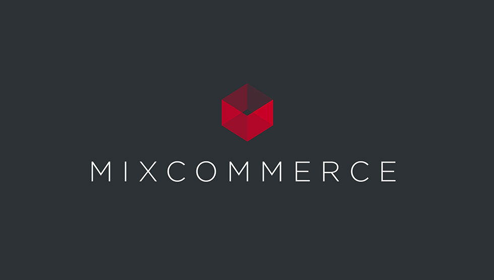
We opted for a new color (ruby) to bring lightness and modernity. The games on transparency also contribute to this effect and convey a double reading:
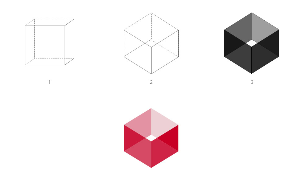
In 3D, the logo refers to the concept cube / package to our own activity and wink to the group.
In 2D, the logo reveals several facets, expressing the many areas of expertise and overall management. These different facets and colors give the impression of a ruby, reflections, bringing therefore the preciousness in our image (preciousness of what we produce, the image of our customers ...)

The Font
We chose a light font (abandoning the double weight), it allowed us to simplify the message and glamorize the logo.
We have worked and increased spacing between letters to win in readability and to sit the logo for giving it a notion of balance, stability.
Creative approach
Visual identity